Empathize
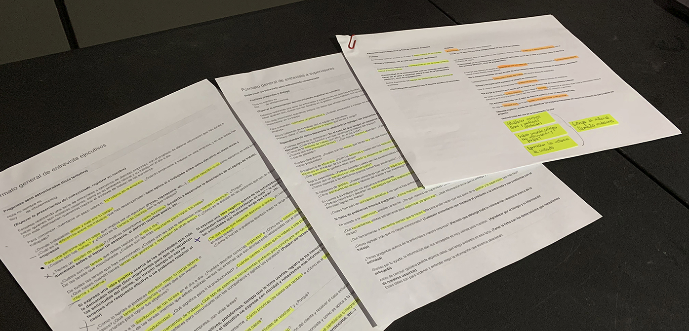
Semi-structured interviews with teams and team leaders.
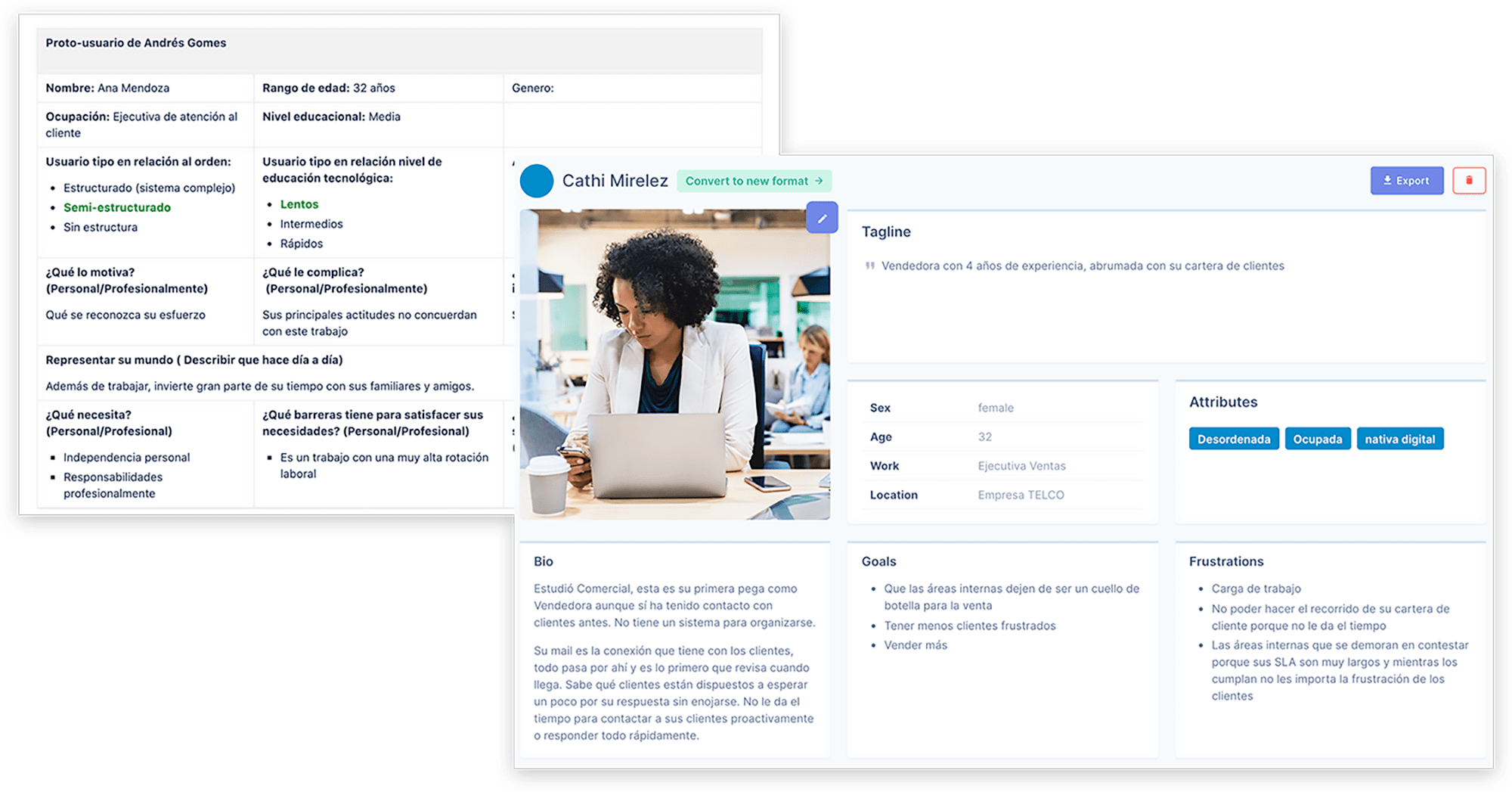
- Building persons or proto-persons through the information obtained.
- Define overall work dynamics of customer service teams.
- Define which methods of customer mail management they usually use.
- Develop a supervisory and management indicators list that can be applied to their work dynamics.
- Questions ideation
- Questions and topics review with team stakeholders
- Application of 4 mock interviews
- Script adjustment and draft questions
To contribute to the user empathizing phase, the interviews were to be conducted by the designer plus a member of the development team as an assistant.
Tools: Printed interviews and voice recorder.


Interview conclusions
Proto-person / persons
Design phase
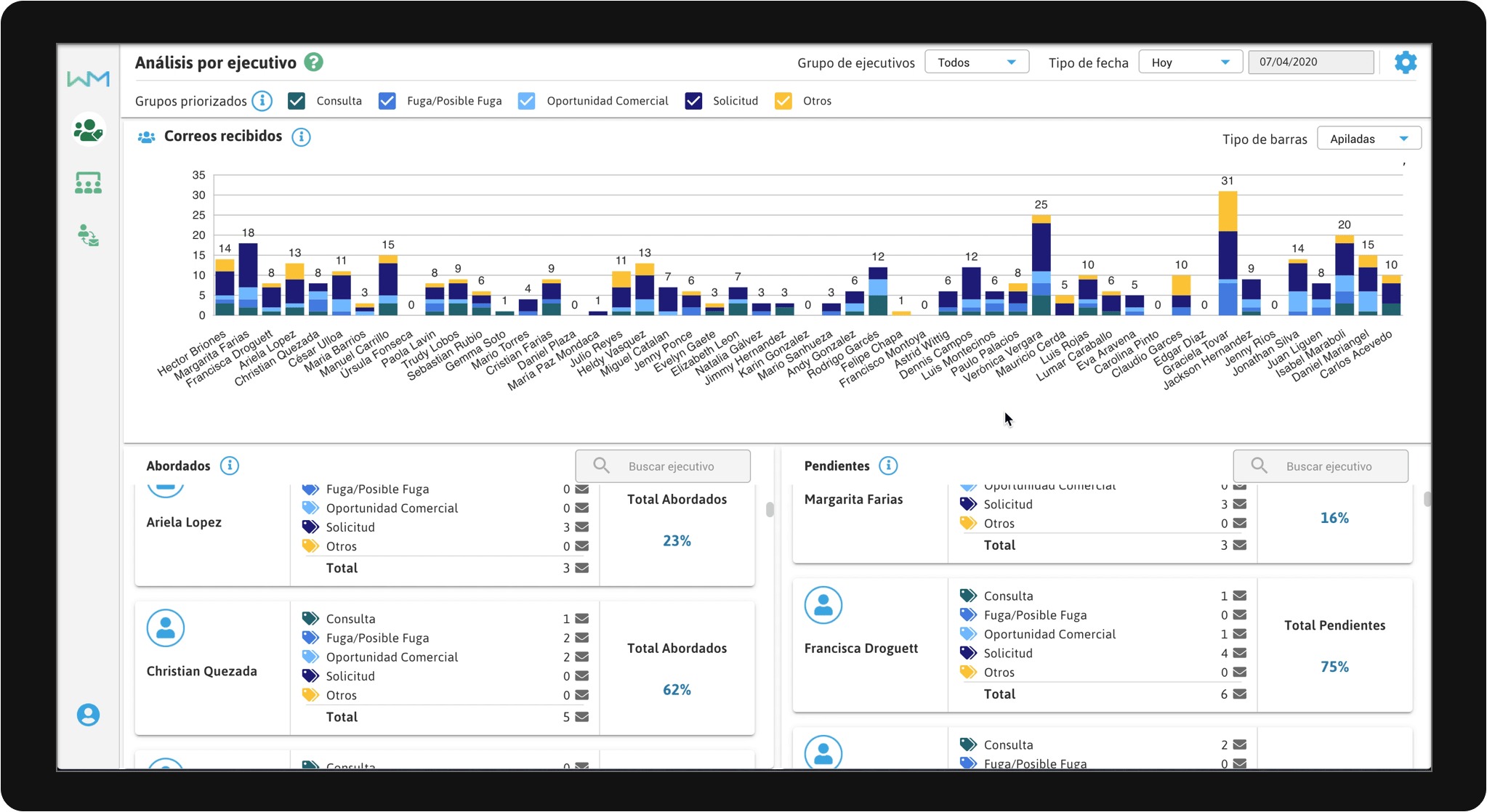
Design scopes and limits were defined: a number of visualizations per dashboard and the amount of presented data, to simplify product usability.
Project formulation
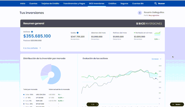
Web App with a set of dashboards that complement each other in function, but with different data visualization objectives on mail management. As a whole, they should extract relevant information with the least effort in analysis, usability, and time spent by the user.
It was determined that customer service teams in companies need to develop strategies based on customer case management indicators. However, they do not count with the time to analyze and extract relevant information from complex visualizations (in terms of data quantity and usability).
To increase the quantity and quality of cases managed by the teams, thus improving customer satisfaction levels. This has a direct impact on the period goals, resulting in increased profits for both the company and the teams.
Design proposal
Working with up to 3 types of visualizations presented at the same time in each dashboard or panel, to control visual stimuli and focus analysis on a narrow context.
Maintain the data visualization mantra: Overview - Zoom and filter - Details on demand
Focus design proposals based on the context of daily use in the teams' work dynamics.
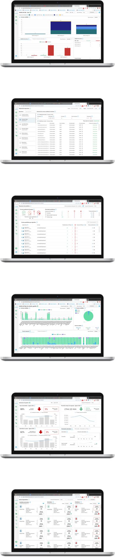
11 dashboard proposals with specific objectives each, of which 8 were taken to the development phase.
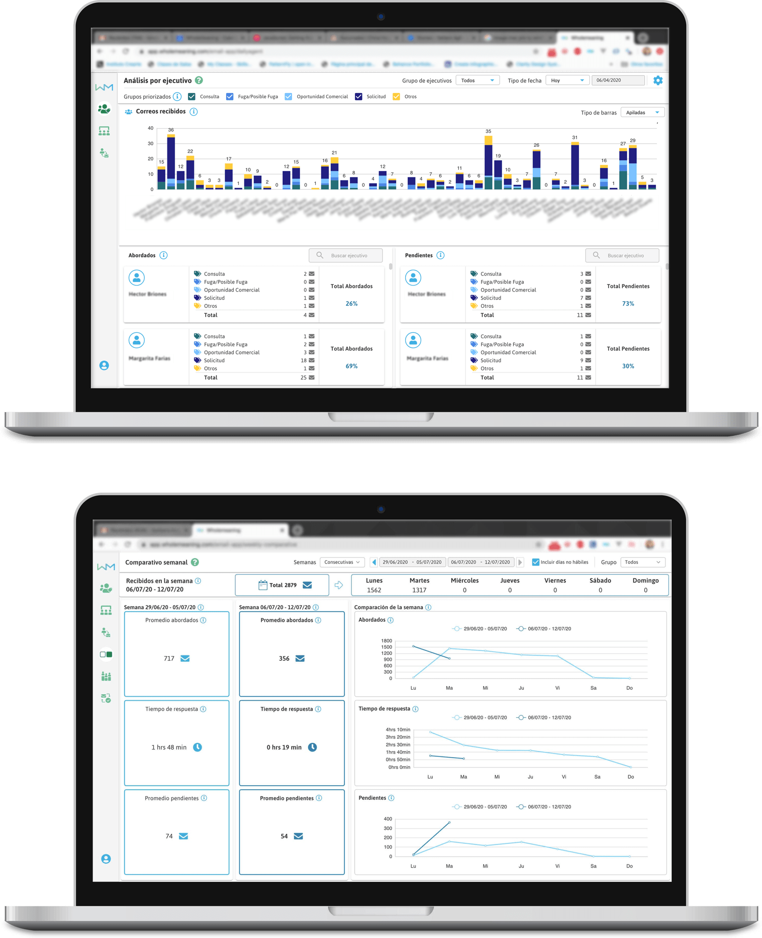
Analysis panel by executive
Cognitive Walkthrough usability testing
Methodological references: NNgroup / Interaction Design Foundation
This test mapped the tasks and steps which could be performed with the features within each designed dashboard. Mapping was organized using branched flow diagrams, to evaluate possible action alternatives on the tasks within the interfaces.
Users: 2 per task, with a basic data visualization interface experience level.
Tests were performed using an under-development app version, with customized tester accounts.
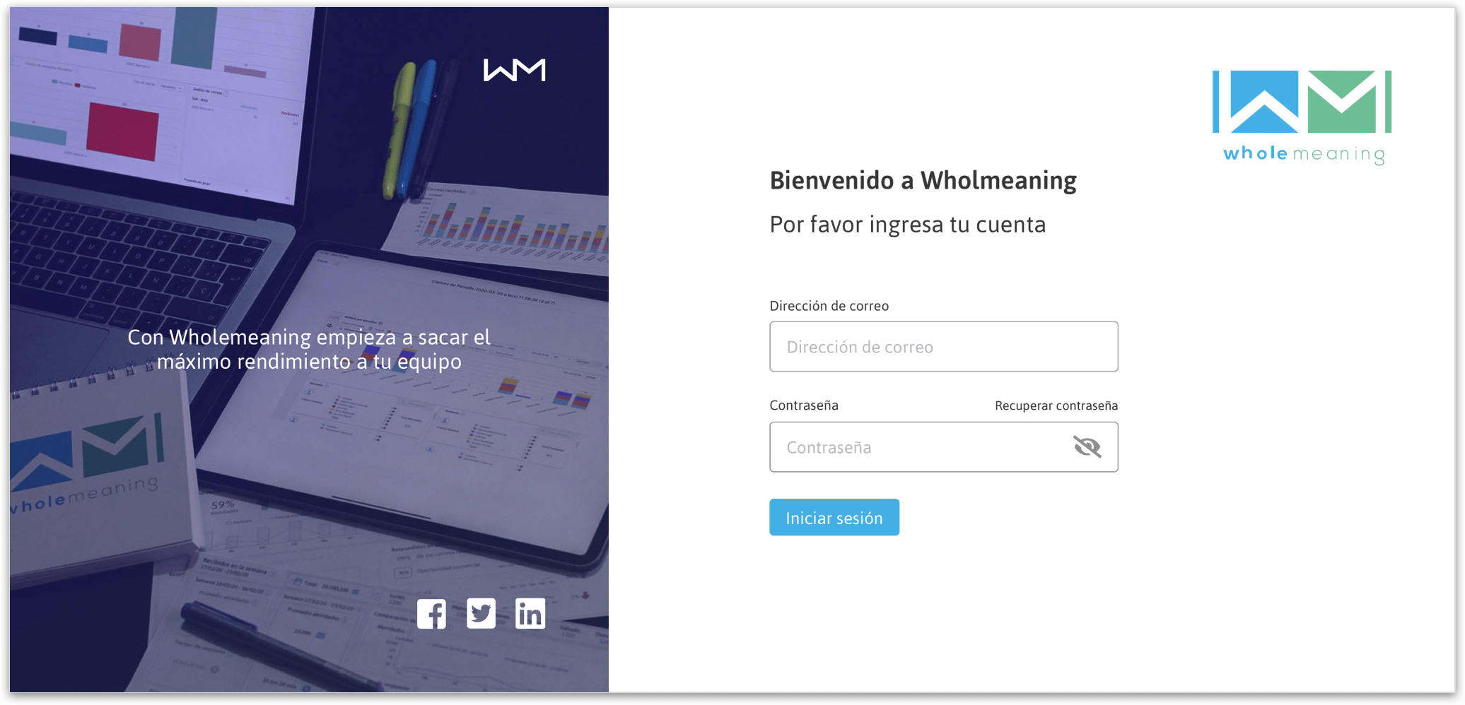
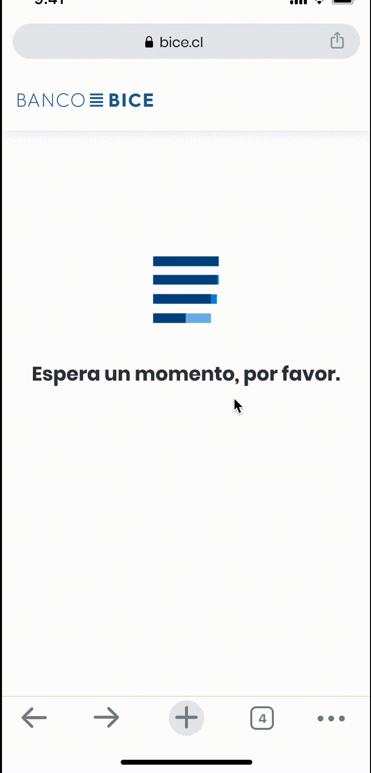
Login action flow
Cognitive Walkthrough testing conclusions
1.- Process resulted in a component, feature, and style redesign within each design proposal, to improve data visualization and user comprehension of the data.
2.- It was decided to make a design work focused on the explanations of concepts within the page, namely: Assistance material, concepts explanatory tooltips, among others.
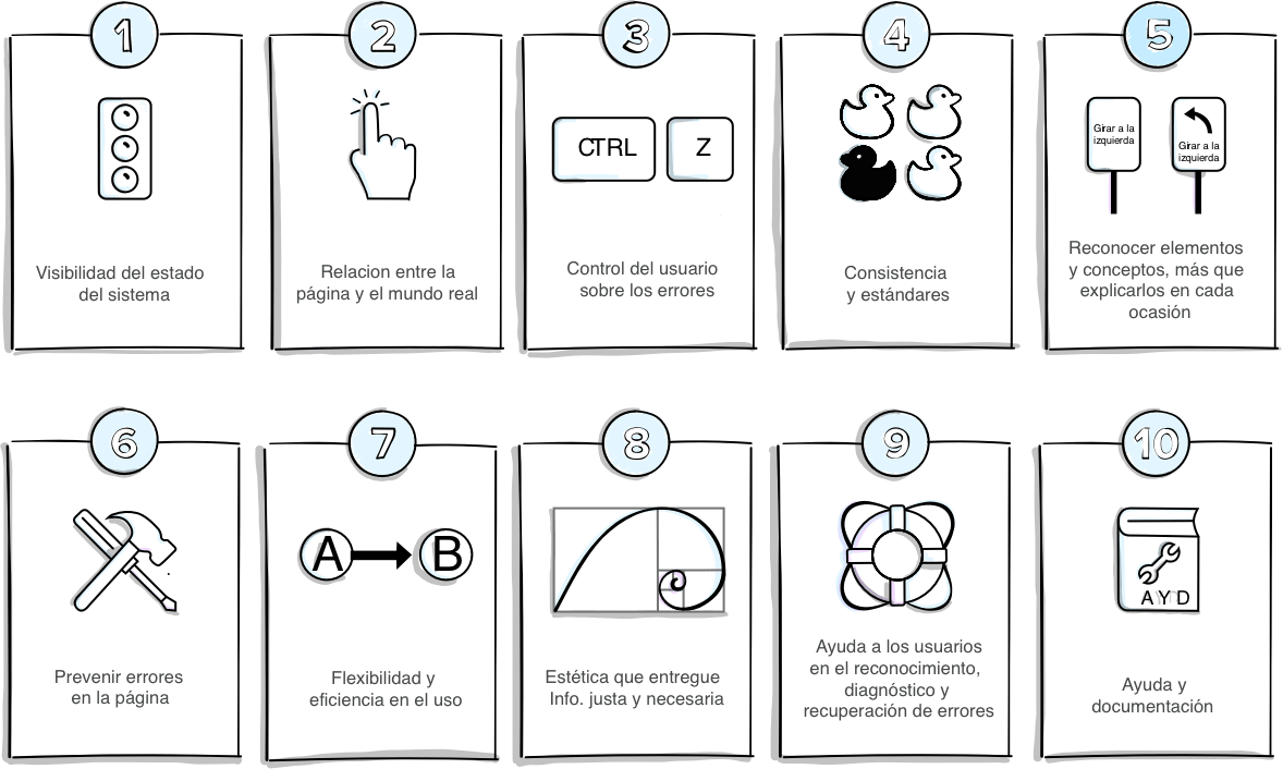
Heuristic usability testing
Methodological references: NNgroup / Nielsen Paper
This test was conceived as a second testing stage in which tester users were asked to use the panels and look for possible problems affecting any of the 10 usability principles pointed out by Nielsen. The feedback document was modified to provide instructions with clear examples according to each user's context.
Users: 5 to 7 per panel, medium-high experience level.
The tests were performed using an under-development app version, running on specially configured tester accounts.
Results: Panels were evaluated according to problem type, affected principle, and each user's perceived level of priority. On this basis, several design problems were detected, as well as some bugs in some features, and explanatory texts that needed to be edited, among other elements to improve the experience.
Design of interface elements
Generic components reused in various panels
Modals
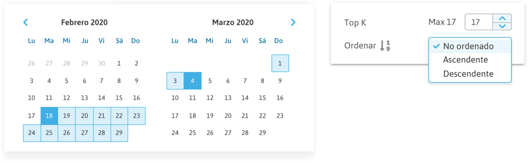
Datepicker
Filters
Selectors

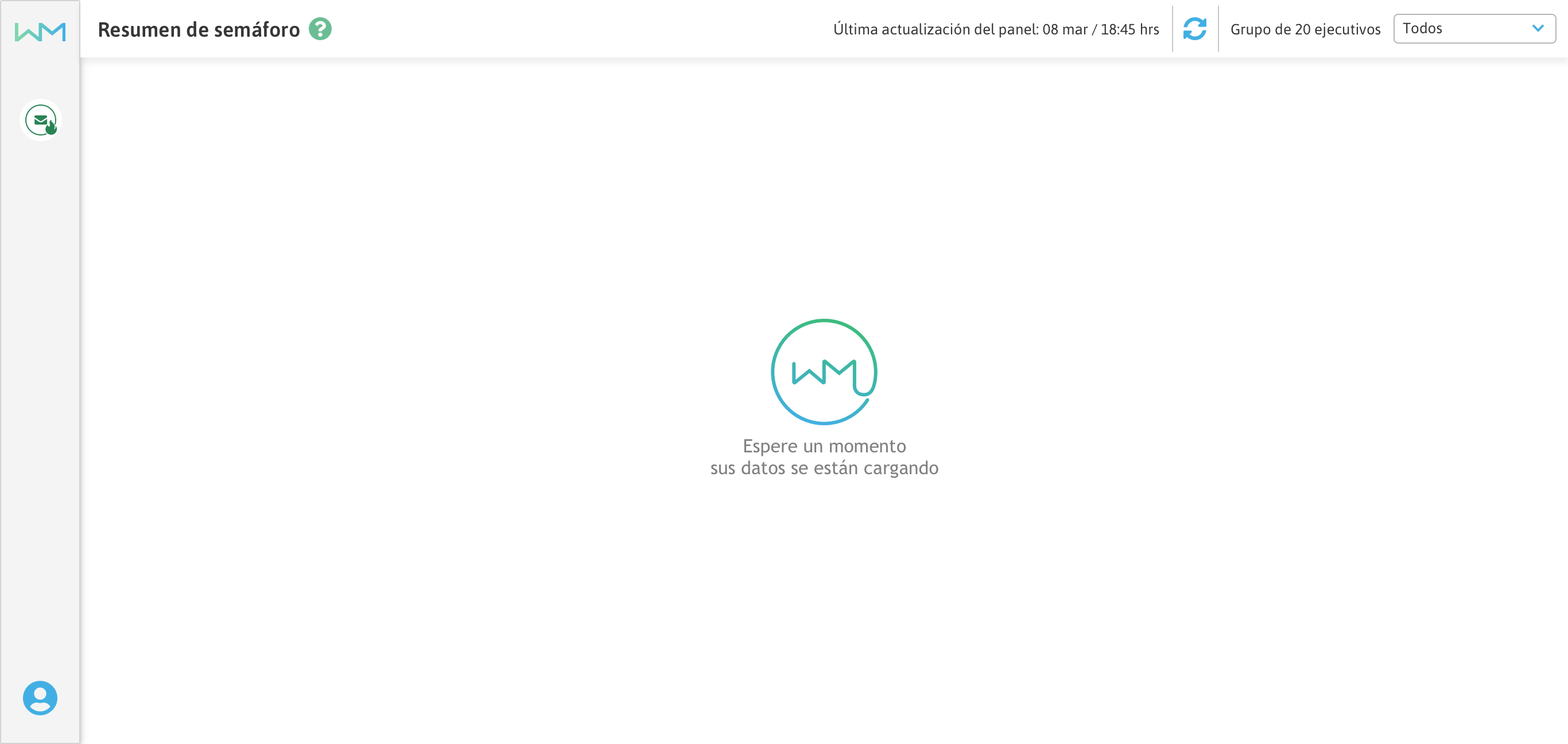
Progress indicator
A spinner was designed to load data from each panel.
Design rescued corporative colors, the company logo, and the mailing management concept.

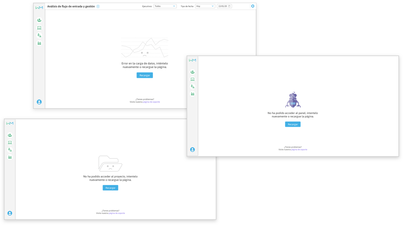
Error screens
Possible errors in the interface were mapped and error flows and messages were designed.
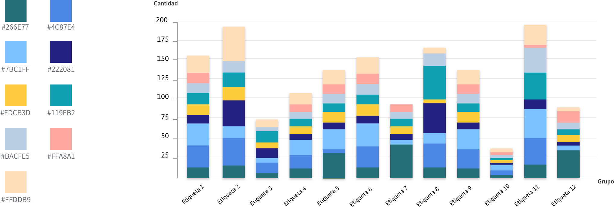
Colors for data visualization elements
Palette was decided by testing color combinations that retained sufficient contrast for users to quickly read the data within the chart.